")
")
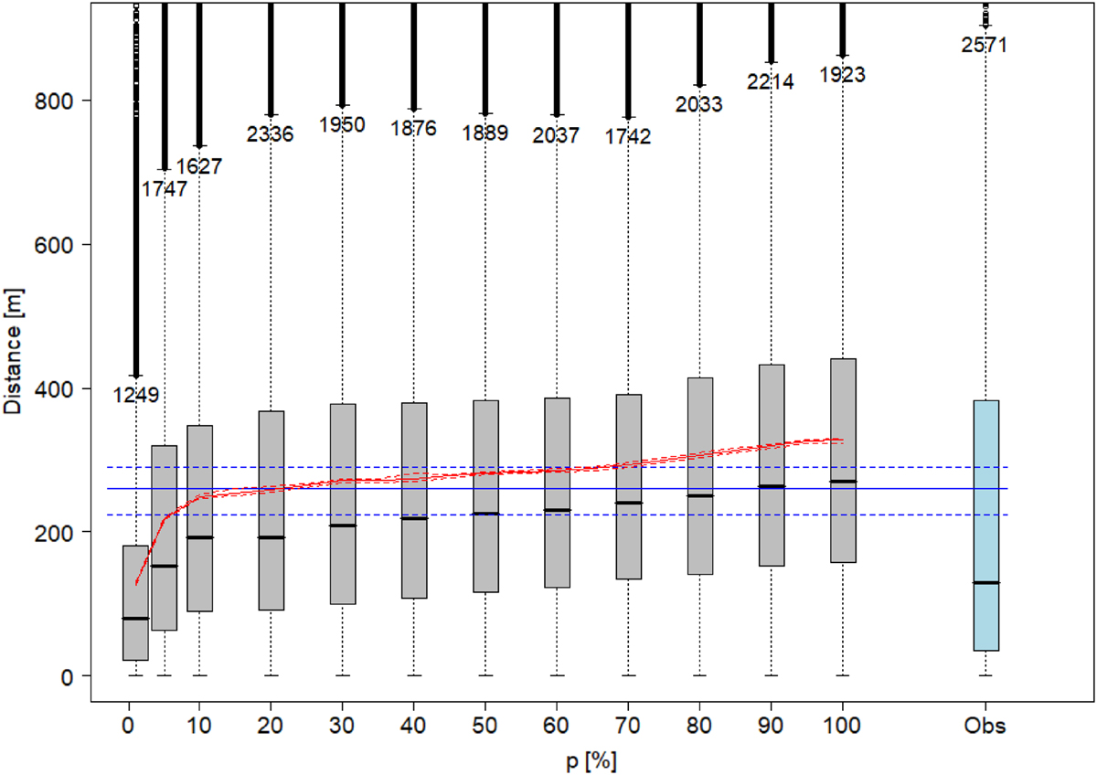
Fig. 3
Download original image
Yearly mean of simulated daily distances for perch as a function of the values of p varying from 1% to 100%. The solid red line is the simulated mean (across all time steps, all individuals and all replicates) and the dashed red lines its range over the ten replicates (very close to the mean). The solid blue line is the yearly mean of observed daily distances over all data for Perch, and the dashed blue lines its 95% confidence interval. Each grey boxplot represents the simulated distribution of the daily distances of the 365 × 50 × 10 days. The blue boxplot stands for observed values. The extreme values of the boxplots are truncated and the maximum value is displayed on each boxplot. Boxplots represent extreme values and 25%, 50% and 75% quantiles.
Current usage metrics show cumulative count of Article Views (full-text article views including HTML views, PDF and ePub downloads, according to the available data) and Abstracts Views on Vision4Press platform.
Data correspond to usage on the plateform after 2015. The current usage metrics is available 48-96 hours after online publication and is updated daily on week days.
Initial download of the metrics may take a while.